Wednesday, July 28, 2021

Kurovadis questions.

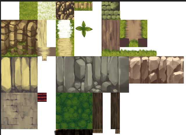
As you already know, I want to put Kurovadis on Steam. However, it is VERY rough. After all, it's been years since it was developed. At the very least, it needs some changes to make it more polished. Like Eroico, I will be changing the title screen, the menus, and replace bad CGs with ones that have already been made to replace them. The tileset will also be very easy to change given how small it is compared to everything I work on these days.

However, there are other changes I could make, and I'm finding it very difficult to decide what course of action to take. On one hand, I know that if I was a player and a developer said they were updating an old game, I would say "don't bother, just work on new games!"

Yet, from a developer's perspective, at the end of the day I'm putting Kurovadis on Steam as a source of income, and I know from experience that there are a lot of small changes I can make that will make it substantially more appealing to new players, and overall more successful. It could be the difference between a game making money for a year, VS making money for 5+ years.

When I look at Kurovadis, I think it has the following problems:

1. Many H animations have too few frames, or are too simple.
2. The powerups you can pick up are not very intuitive, useful or engaging.
3. Level up orbs are not really a good reward for exploring.
4. Enemies are overly simplistic, and most can be bypassed easily.
5. Bosses are too simple, and not really that fun to fight.
6. Some people didn't even know melee existed until the last boss, or see it as so risky that it isn't worth using.
7. The map lacks shortcuts that prevent backtracking, which would probably not be received well, outside of those who see it as a novelty.

In my initial sessions considering what to do I tried changing the combat to include hitstun, and made some moves. (Adding a new move takes less than half a day btw, so don't panic thinking something like this takes months or even a week).


However the more I messed with it, the less sure I was of what to do. Adding hitstun essentially requires programming all the enemies from scratch (prob a day or so each, or half a day per enemy if I'm fast). Yet, adding moves is very easy, and would probably add a lot of appeal. More moves also means more appealing things to find, which encourages exploration.

The other option would be to keep the old combat, and add new moves that way. Though I think that the core animations and melee attacks are not very welcoming in the original. I think the only real "fun" move is the slam attack. Players also probably utilized the charge attack a bit. But without hitstun, enemies basically boil down to beating them up while rolling, assuming you fight them at all.

Then of course...there's the fact that at the end of the day, this is an H game, and people are playing it for that reason. Should I even focus on combat at all when I could spend that same time making H better, or just adding a bunch of new H?

All of that said, what do you think I should do with Kurovadis? What do you think should change, and what should stay the same? I've slapped together some polls, if you want to share your opinion, or you can comment below in more detail.


Monday, July 26, 2021

More 3d. Actually back to work this time.

 Welp, I got carried away learning 3d again. I'll show off some of it here, but I will be going back to working on normal stuff tomorrow. Still not sure how much I will change Kurovadis for Steam, but that's what I'll be working on. I might stream it, though I feel like it might be a bit boring to watch. If I stream, I might have to come up with something else. Maybe an H game jam in a day, or something like that? Dunno.

Anyhow, as for the 3d stuff, initially my goal was to do mockups in various style in order to decide which I would want to do if I did 3d. Last time was a more high poly/modern workflow, abeit trying to keep it practical. This time, I tried working on something more stylized.

Initially, I started doing textures as pixel art. Aiming for something like Megaman Legends.


The style looks good in MML, and obviously I know how to draw pixel art. However, in my rushed example, I found that it wasn't as fun to work on. Possibly just because it was essentially just what I do normally, making pixel art, with a lot of 3d's "cheats" not really available to me. Maybe I'll try some other time, but especially for a fantasy game with a lot of nature and stuff, pixel art seems like it would be very difficult.

Instead, I tried drawing at the same resolution as pixel art, but with normal brushes. Of all the methods, this one seems like it's one of the fastest, since it is more forgiving than high resolution, but maintains some of the appeal of pixel art. To ensure that colors can be easily changed (like pixel art) I used a workflow where every texture is 2 colors, a flat color, and a shadow drawn on a layer above. Any grass, etc, is on the same layer, which means that to change the color of grass on all tiles, you need only change 2 layers.


A variation of this style is to incorporate real textures or finer grit. However I'm not sure if I would do this or not. I think it would work well more a more gritty dark game, like if you were making something with low poly, yet more realistic looking characters.


In my case, each grid cell in Blender is assumed to be 32px. To determine how big a tileset element should be, I would just measure the size of the object in Blender. Like this, you can make pixels a uniform with minimal stretching. Though the smooth shading also makes that more forgiving.


You can also model things as modular parts to be used directly in creating levels/scenery. One of the benefits of  3d is that there is no "tileset", so I can make textures that are smaller than 16px, despite using it like a tileset..


I found that the best approach for me was to seperate the ground and walls into seperate meshes. This also allows you to shape the walls without worring about messing up the grid of other elements.


A common element in older games is Vertex coloring. This can be used to manually add variation to textures. In general it can be used to create trails of color, or highlight certain elements.


Here is an example of the scene with no lighting. Only vertex coloring and fog, in the environment. Like this, color palette is very important, which is why I tried to make sure textures could be easily changed.


One method is to create levels within Unity, but I prefer the control I have working on stuff within Blender. There's a lot of appeal to being able to model something in the exact spot it will be in a scene.


You can use Vertex colors and fog alone, however I find lighting scenes to be fun and interesting. It feels like I'd be missing out if I didn't use lighting. You can apparently bake lighting to vertex colors, but I havn't seen good results with that. You could also manually "light" a scene with vertex colors, but that seems very time consuming.


Fog and environmental color is also very useful. As long as you keep colors in check you can do a lot with scenes.


Still keeping resolutions fairly low for textures, I figured I'd try vertex colors for a skydome. Initially I did it because it's the fastest, but honestly it actually works pretty well.


To make clouds, I just did a transparent image and stuck it off in the distance. Being 3d, of course you can cheat like hell and make a whole sky box out of one cloud.


Just by changing the color of fog, environment color, and the color of the sky, you can change the scene pretty dratically. I'm not sure if it would be better to use this to do real time day/night, or utilize all of it to make very unique areas with a different feel.


The thing to do these days is to tint the whole screen, or use color grading. I dunno, feels like giving up on color to do that. Though it could be that if I try it, I'll find a use for it. A lot of games grossly mis-use certain effects (Like bloom), so it's difficult to know how genuine something is as a tool until you get ahold of it yourself.


Tuesday, July 6, 2021

Recovery, 3d learning, uncertainty.

Recovery so far has been a bit iffy. My health issues have improved, but things are not as normal as I'd hoped they might be. As a result I've found it a bit difficult to get my bearings. There's the constant feeling that I can't relax, and it's difficult to bring myself to focus on work. It's also not often that I feel as though I can commit to streaming (though I will still probably try soon). Inevitably, I end up working on things I just feel like working on that day. While part of the problem is certainly still physical, I need to find some way to get myself out of the rut I'm in.

These days, when I don't feel like working I've gravitated a lot towards learning 3d. I haven't posted in a while, so I figured I may as well go over some of the things I've worked on over the past year, any time I've worked on it.

3d stuff

Thus far, my goal when working on 3d has been to figure out what I would do if I were ever to make a 3d game. Learning the workflow, trying styles, and deciding what kind of projects I would work on. Because I would likely be working by myself, a 3d project would have to be viable for one person.

For many of my early tests, I attempted to stay low poly and minimize texture work. Though these rarely remain low poly and inevitably get more detailed.


Figured out how to do weapon trails in Blender, so that attacks can be animated with a preview. One of the reasons I prefer stylized is that the bar for animations is different. Things can be fairly snappy. Run animations clearly need more than 8 frames though. I tried a lazy one here, and it was too basic.


One of the things I would have to decide on with this sort of style is if the face is drawn, or modeled. Modeling the face is more time consuming, however it does allow you to use shape keys to animate it. With drawn textures, you would need to use some UV tricks.


Tried modeling some low poly armor in disconnected parts. Certainly got me thinking about Dark Souls.


I had recently played Demon Souls, which made me want to try making a mockup of an area. So I started thinking about how I would go about more "realistic" graphics.


I wasn't sure how I would be creating textures, so I looked into some different options. I began using software called Quixel, which allows you to generate textures using existing images, or from scratch.


I decided to try a more "realistic" looking character. 


I generated a texture for hair using Blender's particle hair system.


Using this texture on planes, you can make fairly convincing hair. Using a high enough resolution texture also probably matters a lot for alpha clipping transparency.


Rather than model the back of the head, I tried a method where I leave it blank, and shape the hair first. I think this method is the easiest way of creating hair, for me anyway.


While creating this model, I also realized that there is a fundamental difference between realism and stylized. The stylized method is usually to make things "the color that they are", and you use shadows to add some color. It looks like this,


Whereas if you make the color very dark, and use far higher light values, it looks like this. In general this is more realistic looking because you can use high light values.


Tried a common method wherein textures are automatically applied based on angle. It seems many games are textured like this as a base. It's a bit nuts what you can get away with using only 1-2 textures.


I realized that you can use Blender to generate height maps, using models. This can be used to generate height/displacement maps in Quixel. 


Because Quixel allows you to generate maps from images, I also began taking photos to use as resources. These can be used individually or be combined.


Was amused that using textures without the normal maps kinda looks like a 2000s PC game


I did a lot of tests using different levels of exposure. Seems like finding the right exposure and light settings is as important as many other aspects.


When doing these tests, part of the goal, (contrary to making an amazing looking scene), is to try and find what the minimum amount of work is to make a lazy area look "complete". Referencing AAA games, there are honestly a lot of games with sloppy texture/environment work. Not to say that you should make a game look bad, but it is at least a little reassuring to know that games you enjoyed a lot were far from perfect, and used a lot of the tricks that are available to you. 


Something I noticed when referencing AAA games, is that a common methodology is to model the environment as a trail, which is walled in. This allows you have something like a forest without having a million trees and bushes blocking your view. You put all the props on the sides. This design philosophy is also present in things like Dark Souls, despite those games having a lot of exploration.


I started modeling an enemy with hard modeling (vert by vert). It seemed like it wasn't very intuitive to design detailed enemies while also modeling it and worrying about topology. There's also the issue of normal maps, since you need to generate the normal map from something.


So I looked into the sculpting workflow. Essentially you do an initial sculpt, auto retopo it into a low poly mesh, shrinkwrap it to the original high poly sculpt, and it leaves you with a low poly model you can bake the high poly sculpt to, retaining the sculpt details. 


After sculpting, I can certainly see why monsters tend to look the way they do in modern games. The sculpting work flow makes certain kinds of shapes very easy to produce. It's also easy to make a mess of shapes and simply see where it leads you. There are probably a lot of bad habits to fall into here.


Textures like this in the skin can be made with a brush and randomized rotation. This one is actually a brick texture being used as a brush. It seems like in general, one of the skills in sculpting is knowing when to use large details, and when to use small details, since it's not like the enemy will always be right next to the player, and they should read well at a distance.


And that's the most recent model I've worked on. Honestly, I've been kind of surprised how easy the workflow is. We're lucky to have some stupidly useful tools, like ones that generate maps from a single image, or auto retopo software etc. At this point, I'm not really sure what sort of style I would go for in an H game. Originally I figured there's no way I'd do modern/realism, but the workflow is actually pretty simple. Though ultimately it is still slower.

I'm also not sure when I will be working on 3d. If I eventually do bring myself to stream my work, perhaps I should set aside one day a weak for 3d, and stream the learning process too. Dunno yet.

Anyhow..that's all for now. Hopefully I will bring myself to get back to work, and stream it at some point. I need to do something to break up the state of things, though.