First of all, it’s important to note that this is not a step by step tutorial on how to draw a character. Rather, it assumes that you’ve at least tried to draw a character, and acts as a guide on how to correct a lot of the problems you may encounter early on, when you’re either new to pixel art or trying to improve.
If you’ve drawn a sprite before, it might be helpful to load it up and follow along. If you haven’t, try doing something quick before we start.
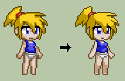
That said, If you've made some of the mistakes I'm about to go over, your sprite might look something like this;
Regardless of whether or not you’re proud or horrified, don’t worry about it; because there’s a lot you can do to make a sprite like this better without much effort. Here's a list of a lot of the mistakes I see (and made myself when I began), and how to deal with them.
1 - Too many colors. Low Contrast.
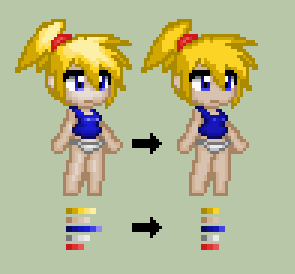
First thing's first; While using a lot of colors may seem like a good idea at first, it also makes your sprite harder to work with. The more colors you use, the longer it will take to animate your sprite, and while using a lot of colors can look good if you know what you’re doing, it’s not going to look better. Just “different”. In game development that time can mean a lot.
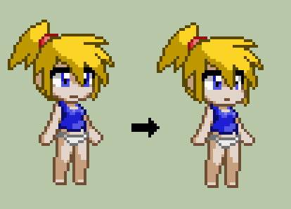
So, take that mess of colors, and lower it down to 3-4 shades per color, at most.
So, take that mess of colors, and lower it down to 3-4 shades per color, at most.
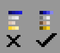
Of course, limiting the colors won't mean much if the colors are bad. Every color should be different enough to justify actually including it. With the above sprites, some of the shades are so similar that they’re difficult to distinguish from each other. Like I said before, more color means more work, and if the color has no purpose, then it shouldn’t be there.
Now, there’s no rule for how much contrast you should use. You’re just going to have to get a feel for it. However, if you want a rough estimate, then just use a difference of at least 40-50 between each shade. Even when zoomed out a bit, you should be able to see the difference between them.
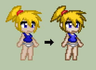
Now, you may be thinking “AH! My once awesome sprite! Why is it so jaggy and harsh now?! I TRUSTED YOU”. Well, don’t worry. It doesn’t look bad because of the contrast. Rather, it looks bad because the contrast isn’t being “utilized” yet. Trust me, contrast is your friend.
2 - Messy lines
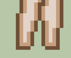
Before we go any further, it’s important to have clean lines. This is actually a problem I see with a lot of decent pixels artists, be it out of laziness, or just not realizing it. Here’s a few example of messy lines, and the cleaner versions.

Basically, you want to limit everything to a single line of pixels when possible. Being clean also includes making sure that curves are actually curves.
2 - Messy lines
Before we go any further, it’s important to have clean lines. This is actually a problem I see with a lot of decent pixels artists, be it out of laziness, or just not realizing it. Here’s a few example of messy lines, and the cleaner versions.

Basically, you want to limit everything to a single line of pixels when possible. Being clean also includes making sure that curves are actually curves.
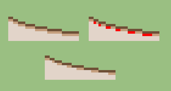
3 - Parallel lines
Basically, when two lines of pixels are next to one another, it exaggerates the fact that they're square and looks jaggy. You can fix this sort of thing by “rounding” the edges of these groups of pixels.
The difference is subtle, but noticeable. Basically, everything will look smoother, and the technique is essential for making things look curved.
4 - Pillow shading. Lighting
Now, to address the elephant in the room..
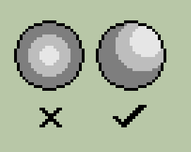
Pillow shading is when you just shade from the edges towards the center.
The key to solving this problem is using lighting direction, and keeping it consistent. However, keep in mind that shadows help to give a shape volume, and so the shape of the shadow matters a lot. When adding any shadow, think to yourself, "why is this here"?. If the answer is "because it's easier" then it's probably in the wrong place.
5 - Face Shape
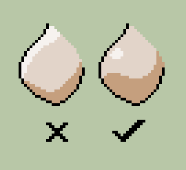
Another thing I see a lot in pixel art are these sort of “caved in” faces. I guess as a result of people trying to draw the same way they do at a higher res but running out of space.
Particularly with stylized characters, it often helps to puff out the cheeks a bit, and make the head more bottom heavy. This will usually work well with low-res sprites. I also made the right eye smaller to conform to the shape of the face more.
6 - Hue/Sat Shifting
Finally....time to talk about color some more.
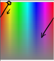
The problem with our current colors is that only the brightness changes between shades, which is a little boring. Colors like yellow are especially bad for shadows, since they end up kind of ******** colored.
The higher the brightness - The higher the saturation
The lower the brightness - The lower the saturation.
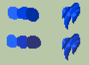
In this example, the first one only changes brightness, whereas the second changes saturation as well. The de-saturated mid-tone helps the highlight "pop"
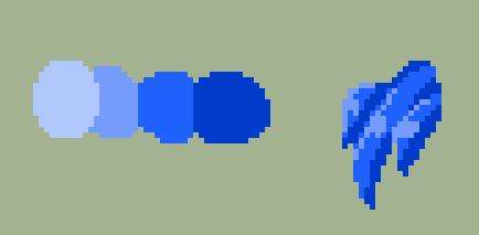
However, what about with brighter colors?
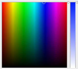
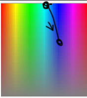
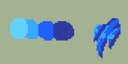
The problem is that if you just raise the brightness of the blue, it becomes pale. It can't be any more saturated than it is, and so the highlights don't "pop" anymore, because the mid-tones are more saturated. This is where Hue comes in. If you shift the hue and saturation sort of like this,
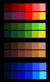
The cyan appears more saturated than the blue, preventing it from appearing washed out. Here's a few examples with other colors. You can do the same thing with any other color.
The basic rule of thumb is; shift the hue towards blue as the color get's darker, and shift the hue towards yellow as the color gets brighter. These "patterns" all follow the same scheme. Here's what the yellow to blue pattern above looks like
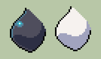
There are some exceptions to these rules. For example, because white and dark grey colors have no saturation, they have saturated shadows instead.
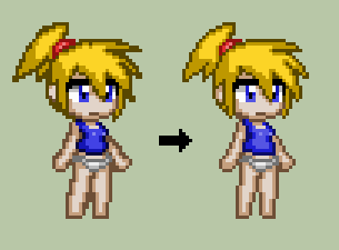
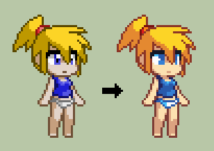
Finally, using everything I mentioned above, here's what the sprite looks like with colors that utilize hue and saturation shifting. (+ a minor change to the eyes)
And if you color lines next to highlights with shadow colors...
7 - Head size
It's common to make the head too big, overestimating how much room you need for expressions. I learned the hard way that big heads = characters that can't stick their heads where you want them to. While this is a personal choice, it's something to keep in mind.
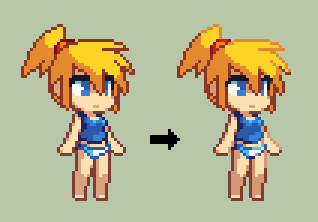
And that about wraps it up for now. Here's the final result.



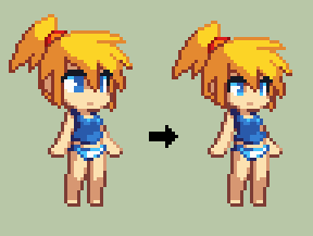
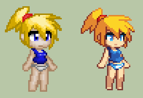
Absolutely awesome! This is very helpful!
ReplyDelete"if you're a total beginner, then chances are your first sprite looks something like this,"
ReplyDelete... I'll see myself out.
Thanks Kyrieru. Very helpful tutorial. Nothing beats practice, but good advice never hurt anybody. =)
ReplyDeletethe final product looks totally different! really helpful tutorial =D
ReplyDeleteIf only my first sprite(s) looked like that. >.> Thanks for the tutorial.
ReplyDeleteI disagree with you on saturation, but otherwise this is pretty great
ReplyDeleteMind blown. Have no prior knowledge about sprite art, very interesting to see techniques explained.
ReplyDeleteIt would probably look like that if you had done some drawing before trying pixel art, but probably not if you're starting at absolute zero. I'd recommend learning to draw at least a little bit since a lot of it will carry over in some way or another.
ReplyDeleteThis is actually very helpful. I knew a lot of it through trial and error, but there is lots that I didn't know which is going to be quite helpful. In particular, I will have to play with contrast and get a feel for it.
ReplyDeleteI'm curious about one thing though: I'm working on a project which will ultimately involve several hundred different animated sprites, and I'm having trouble keeping a unified style. Do you have any recommendations for controlling style across an entire production?
Depends what you mean by style. When I'm creating new enemies/NPCs, I start by placing the player's idle frame for reference. When deciding on final colors for everything, I do it over top of backgrounds from the game, and see how it looks in-game as well.
DeleteAs for color and contrast, etc; if you want to choose a "style", then just look at each element individually.
-how many shades per color
-are there outlines
-outline color
-color tone (muted, water color, super colorful)
-shadow direction
-details (hair highlights, how eyes are colored, how expressions look, etc)
Wow, the Hue/Sat trick is pretty neat, I never noticed it before.
ReplyDeleteyou just turned trash to art
ReplyDeleteHey, i was wondering if you could give some tips on how to make a game. Thanks in advance
ReplyDeleteIsn't much to say; learn the individual skills you need in order to make a game (or at least the ones you're willing to learn) and go from there. Until then, without a problem there is no solution.
DeleteHi Kyrieru! I subscribed to you as patron, I hope to learn more from you! I really love the part about the colours. It really helped!
ReplyDeleteGlad to hear it helped. Still need to do that animation tutorial I promised.
DeleteWow, thank you Kyrieru))))
ReplyDeleteI'm not really a huge fan of adult games, and before this, I wasn't really familiar with your work, but your advice has helped immensely. I'd just like to say thanks!
ReplyDeleteGlad hear!
DeleteGlad to hear even -__-
DeleteHi! May I ask what software/app/program are you using for animating?
ReplyDeleteIm having truble animating in krita...
Aseprite.
DeleteI took up spriting a few years ago on a whim while having zero prior art background because I wanted to edit certain characters for H-Mugen. I still have a TON to learn but the more experienced I get, the more I realize that trying to cram in additional colors or shade depth often just damages the result. It's still my first reflex to do all the newbie things you listed and learning to dial back on them was when I first began to notice that I was genuinely improving. Though honestly, I still sometimes knowingly leave things "wrong" for some odd reason. O.o
DeleteShades/shadowing is still routinely a legitimate hang-up for me, however. My brain just isn't overly great at visualizing the direction, gradient, and contour necessary for the desired effect and I often have to resort to hours of trial and error just to get single shadows right without even knowing WHY it was right, if it even WAS right at all. Getting some proper shading sense slapped into me is the #1 thing I think I need before I get to call myself a proper spriter. :p
: today I learn.. thanks.. a lot..
ReplyDeletehope you get better
ReplyDeletegreat tips for physical static media like perler beads too :) ty!
ReplyDeleteEu nunca vou conseguir te agradecer o bastante.
ReplyDelete